Stomping Ground wins GABS Can Design Awards
Content published under the media release byline is promotional content produced by the business(es) named in the media release and remains unedited by Brews News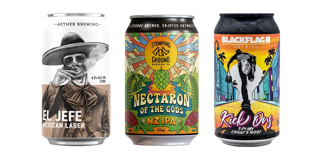
Imagine a design inspired by abstract, psychedelic illustrations from the 60s and 70s displaying the beauty of New Zealand with its blue lakes and snow-covered peaks, combined with a tropical like Garden of Eden. Or how about an illustration of street artwork that captures the essence of the sunrise colours and back alleys of Sunshine Coast. Perhaps a smoking gothic macabre skeleton or and an out of this world, super cool, robot with a contemplative, almost melancholy expression reminiscent of an image you would find on a classic sci-fi paperback.
It is unlikely your first thought of such incredibly creative and stunning artworks would be that these are found on the outside of Australian Craft Brewery Beer Cans! These are just some of the brilliant inspirations behind the record 145 Craft Breweries who each nominated one entry in this year’s prestigious GABS Craft Brewery Can Design Awards.
After beer lovers and art appreciators cast a people’s choice vote for their three favourtite designs to establish the TOP 10 finalists, it was over to a panel of brand expert judges, including Adrian Mills Deloitte Australia, Emma Robbins M&C Saatchi, Ben Keenan The Thought Police, Andrew Morwood Orora Group, Francesca Lucas BoozeBud and Paul Haggett Opal Speciality Packaging who had an incredibly difficult job of evaluating the finalists across six different categories (visual & aesthetic appeal, creativity & originality, impact, brand identity, usability & messaging and design brief).
In the tightest of possible finishes with very little to separate the top 10, the winner of the GABS Can Design Awards 2021 taking home first prize and the prestigious Orora Golden Trophy is Victoria’s Stomping Ground Brewing Company’s ‘NECTARON OF THE GODS’ designed by Terry Ricardo.
Queensland took out silver and bronze with Blackflag’s Kick Ons (Ross Holloway) and Aether’s El Jefe (Steve Falco, Procreative). Topping the charts in South Australia was 2020 winner Little Bang with their Zero Kelvin Cold IPA (Matt O’Connor). Honours in ACT went to Capital Brewing Co’s Capital Growler (Mick Healy) and in NSW Bucketty’s Brewing Co’s Tawny Grogmouth (Brent Turner). Gage Road Brew Co’s Dawn Patrol Breakfast Stout (Dwight O’Neil) drove into top spot in WA and state honours in Tasmania went to Moo Brew’s Hazy Pale (David Cambell, Mona)
Head over to what is being acknowledged as the best virtual craft brewery can design art gallery in Australia to get a true reflection on just how talented the designers behind some of your favourite brewery beers are and discover who this year’s top 5 in each state are.
“What an incredible celebration of our amazing Australian Craft Brewery Industry with record nominations and the talent and creativity on the outside of eachtin matching the brilliant craft beverages inside! We were so pleased to be able to bring some joy to craft lovers and help the industry that gives us so much pleasure to come roaring back after another difficult covid impacted year.” – Mike Bray, GABS Craft Beer & Cider Festival.
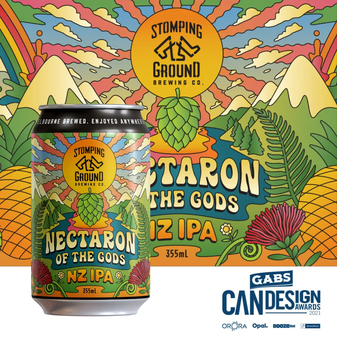 WINNER
Nectaron of the Gods NZ IPA
Stomping Ground Brewing Co (VIC)
The Nectaron of the Gods design was inspired by abstract, psychedelic illustrations from the 60s and 70s. Playing on the phrase ‘nectar of the gods’, the idea was to communicate a divine, out of this world nectar, made using a variety of hops from New Zealand, primarily, Nectaron. In creating the scene we turned to the beauty of NZ with its blue lakes and snow covered peaks, combined with a tropical, otherworldly looking landscape like the Garden of Eden. On closer inspection, you’ll find iconic NZ flora and key tasting characteristics of this magical brew.
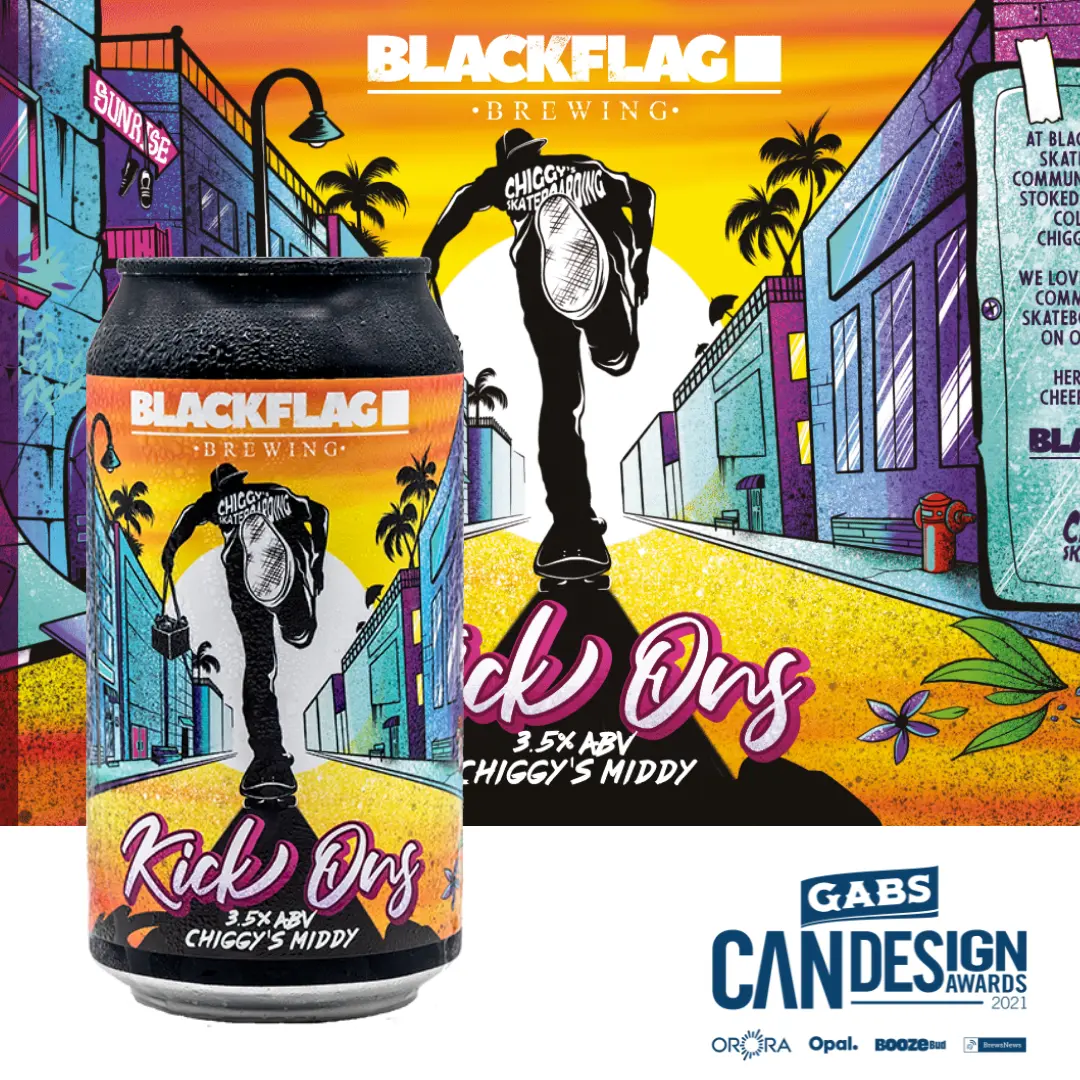 SECOND
Kick Ons
Blackflag Brewing (QLD)
The intention was to capture the essence of the back alleys of Sunshine Coast and the skate scene that kills it in the community led by our good friend Chiggy and his crew. We worked with a direction that captured the ‘skate away’ style to create a hand drawn design adding in elements referencing ‘Kick Ons’ in multiple ways, firstly skating and secondly finishing the night in fine form. From kicked up pavement and graff, the grip tape/concrete feel as well as the typical Sunny Coast Palms, the image portrays the early morning sunrise colours to definitively pick up the cans name Kick Ons. The beer to finish the night in proper form.
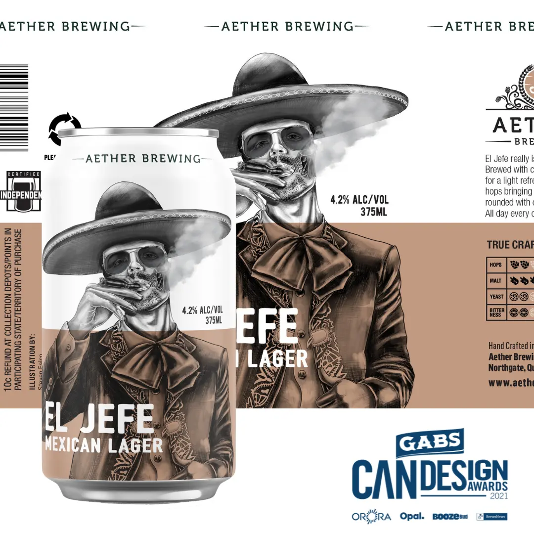 THIRD
THIRD
El Jefe
Aether Brewing (QLD)
This design is an expression of the Mexican beer style, intertwined with subtle hints of our overall gothic branding theme using macabre skeletons and skulls.
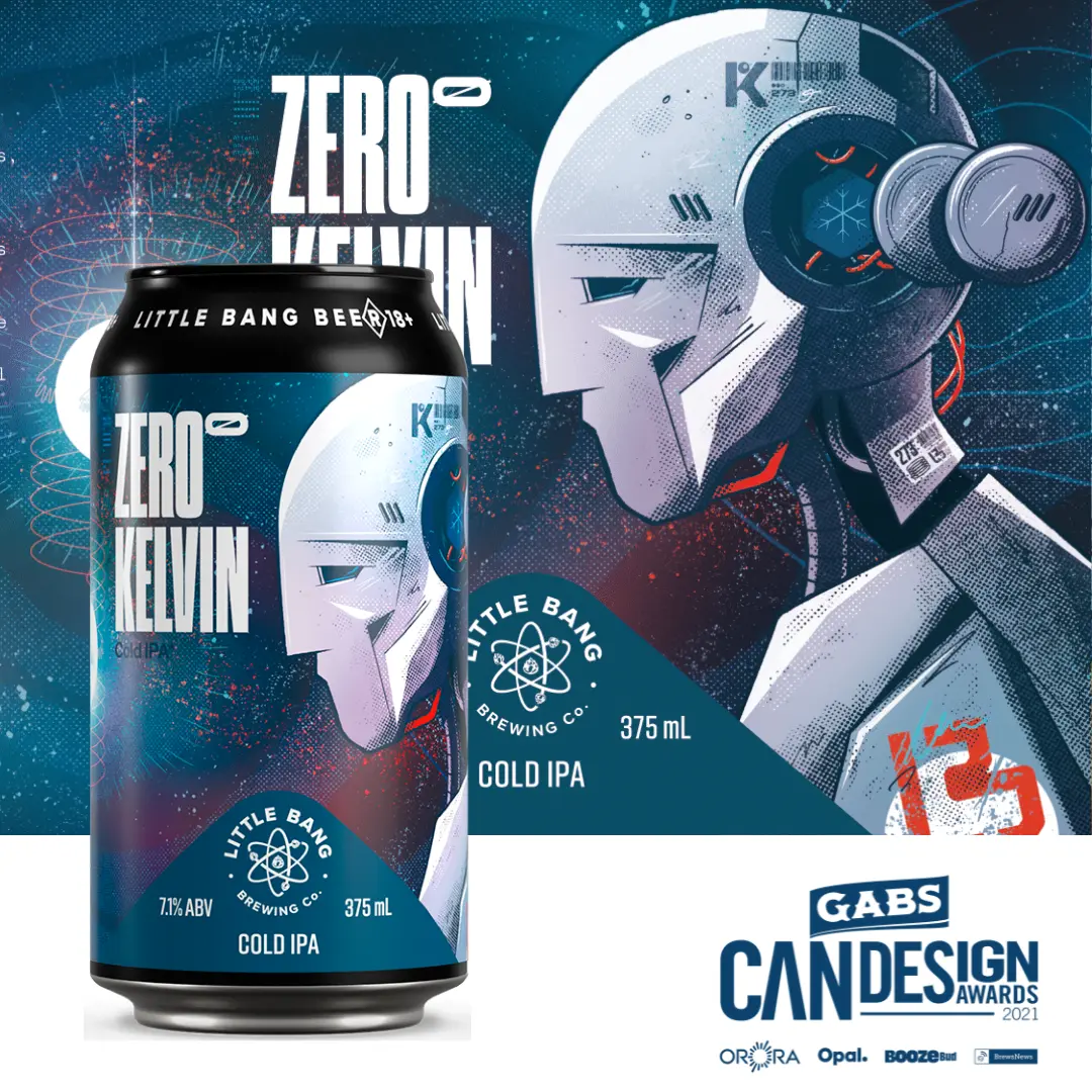 FINALISTS 4 TO 10
Zero Kelvin Cold IPA
The Cold IPA style is sharp, crisp and pristine. So is Kelvin. Despite his sub zero environment and steel casing, he is full of depth and character. In a chaotic world of crazy, noisy branding, Zero Kelvin stands out by speaking quietly and profoundly. Also robots are super cool.
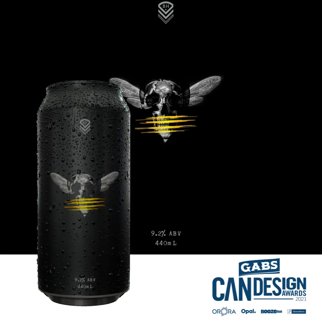 Murder Hornet Imperial IPA
Black Hops Brewing (QLD)
Murder Hornet was to be the flagship beer of the series and Dan and the team were keen for a label to match and set the tone for the rest of the series. With words like murder, kill, swarm, sting, intense, predator and prey all floating around in the beer description, I felt I needed something pretty haunting. Skulls. I dig ’em. Always have. Hornet + Skull. What does that look like? I didn’t know, but after grabbing some images and trying a few things in photoshop I hit on a particular blending layer and boom – there it was staring me in the face. Murder Hornet. I put it on the can. Full Black. Drop the logo. Ditch the name. ABV and Volume only. But it needed something extra. The orange needed to appear somewhere. I tried bringing it into the tail of the hornet but it just looked a bit weird, and then I thought, what else looks kinda scary? Claw marks. yeah they freak me out. So I put 4 orange scratches over the skull to symbolise the hornet tail markings and reference the 4th birthday. I sent the design back to Dan with the simple words: “It needed to be scarier.”
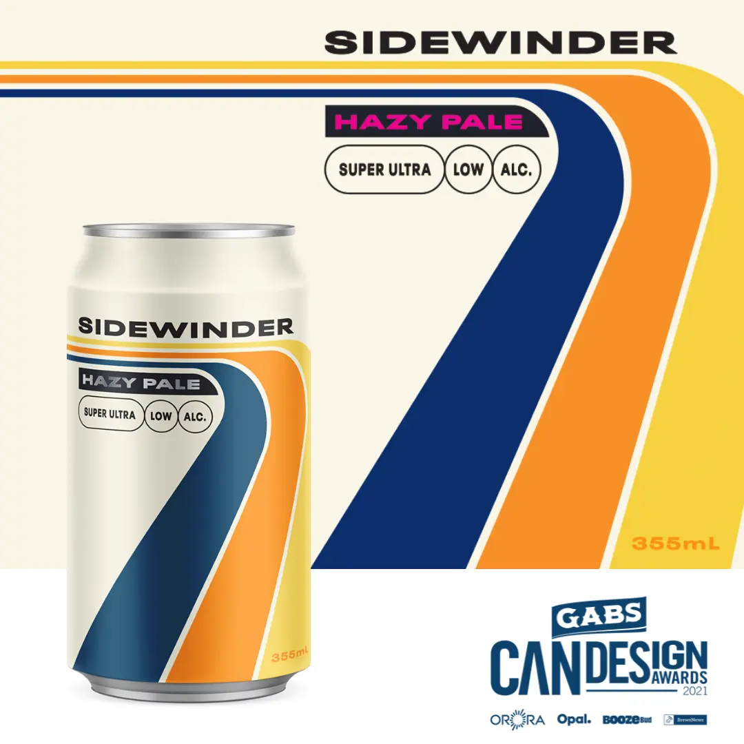 Sidewinder Hazy Pale
Brick Lane Brewing (VIC)
Sidewinder was designed to capture the freedom and ease of the 70’s, a time when life could be led more spontaneous and carefree. At only 0.3 standard drinks, Sidewinder Hazy Pale was created with the intent that neither flavour nor the drinking experience need be jeopardised in the quest to include low alcohol options in your day. The can design captures this intent to enjoy the moment with a beer proud to hold, without the overt no/low alcohol references. With a playful and charismatic can in hand, complete with Sandman inspired stripes, drinkers can live the Sidewinder life without compromise.
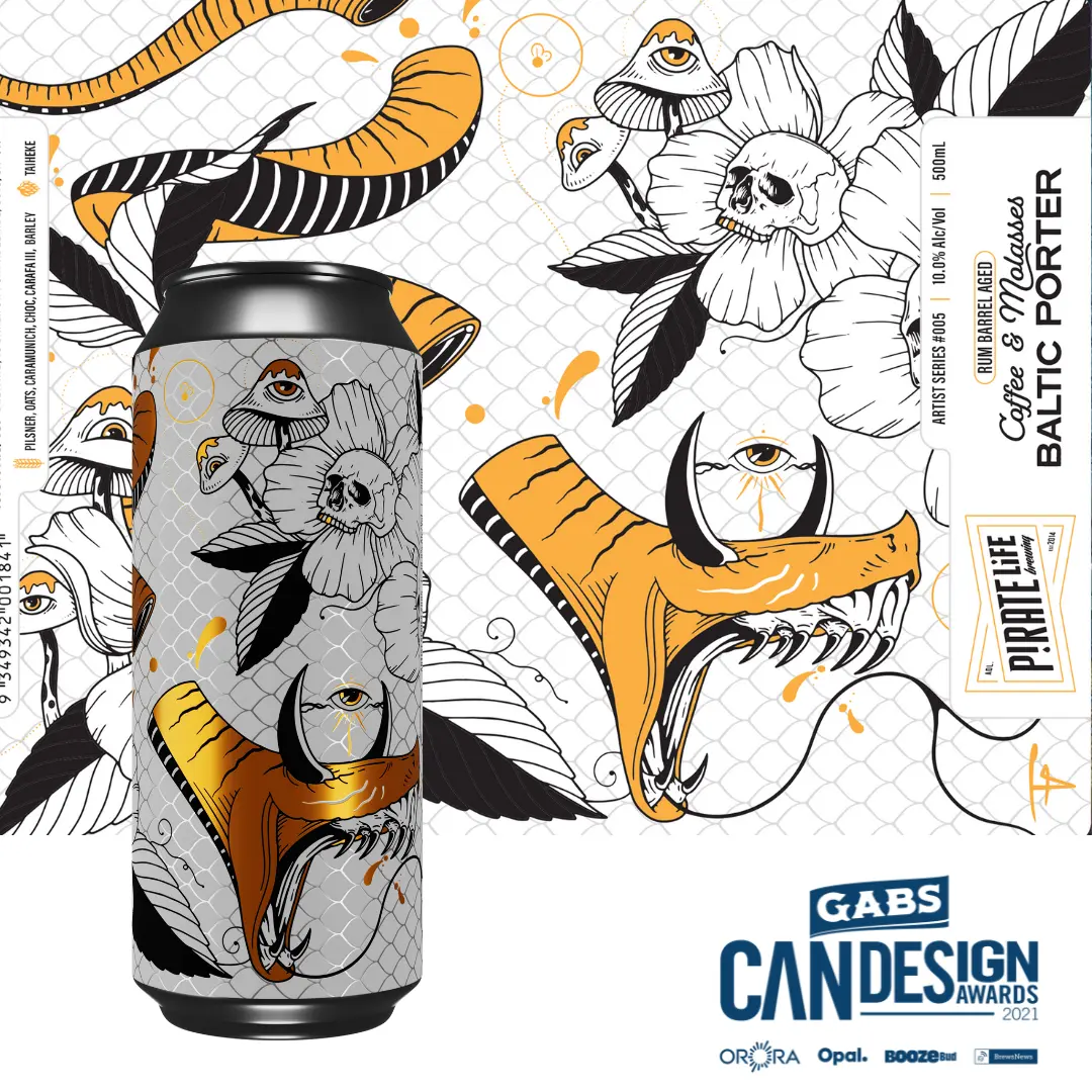 Rum Barrel Aged Coffee & Molasses Baltic Porter
Pirate Life Brewing (SA)
This label is a mix of themes and imagery that I personally love to draw. It’s a Frankenstein mashup of past and present original tattoo designs, and ideas melded into one cohesive image to wrap around the can. I wanted it to be dark and gnarly, and a bit twisted which could be matched up with something of a similar creation by the crew at Pirate Life. It’s true to my style – just like the liquid that’s within the can.
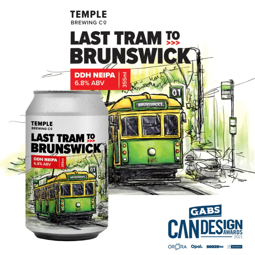 Last Tram to Brunswick
Temple Brewing Co (VIC)
The design is based on the 2020’s ‘Last Train to Boston’ and hand-painted in watercolour style to represent Brunswick East, a suburb full of street art. It is directly associated with the title and includes several hidden ‘easter eggs’. The tram no. 01 is the tram that leads to Brunswick East and stops at number 121, the stop to reach the brewery. The title is based on the styling of PTV. There is a ‘Last Train to Boston’ advertisement on the side of the tram to link back to the previous release. There are also hidden hops in the background.
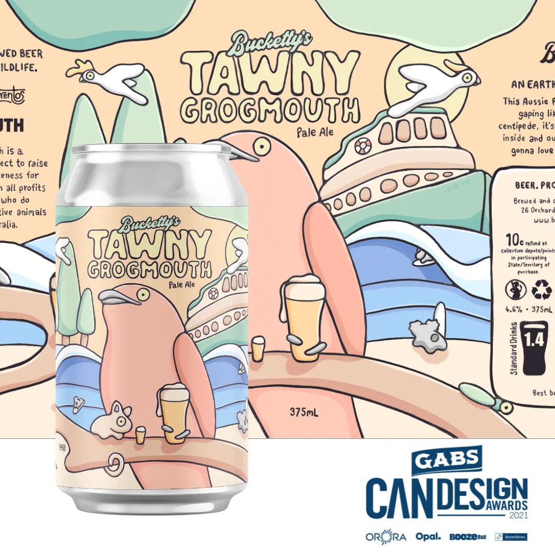 Tawny Grogmouth
Bucketty’s Brewing Co (NSW)
We wanted something that represented the beach, Australia, beer and of course the Tawny!
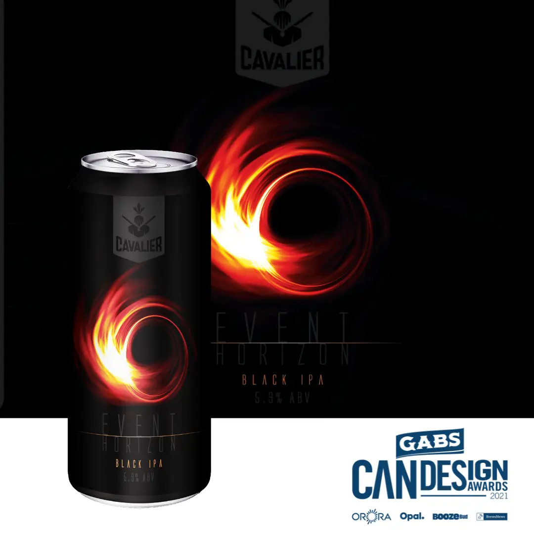 Event Horizon Black IPA
Cavalier Brewing (VIC)
The Event Horizon – the point at which a Black Hole absorbs light, black as black can be. Cavalier Event Horizon Black IPA is the very manifestation of the suggestion. The image used on the label is the result of 160 telescopes spanning the world over fixated on a single black hole, pieced together to capture the moment, the Event Horizon absorbs the light. Fitting we thought, for a Black as Night, blacker than black, Black IPA.
The GABS Can Design Awards is proudly presented by Orora Group, Australia’s largest beverage can solutions provider, and supported by Opal Specialty Packaging, the country’s leading experts in renewable packaging; Boozebud, the online alcohol retail specialists and leading industry publisher, Australian Brews News.
