Tooheys introduces a new look for the iconic brand
Content published as an Announcement is produced by the business(es) named in the announcement and remains unedited by Brews News.
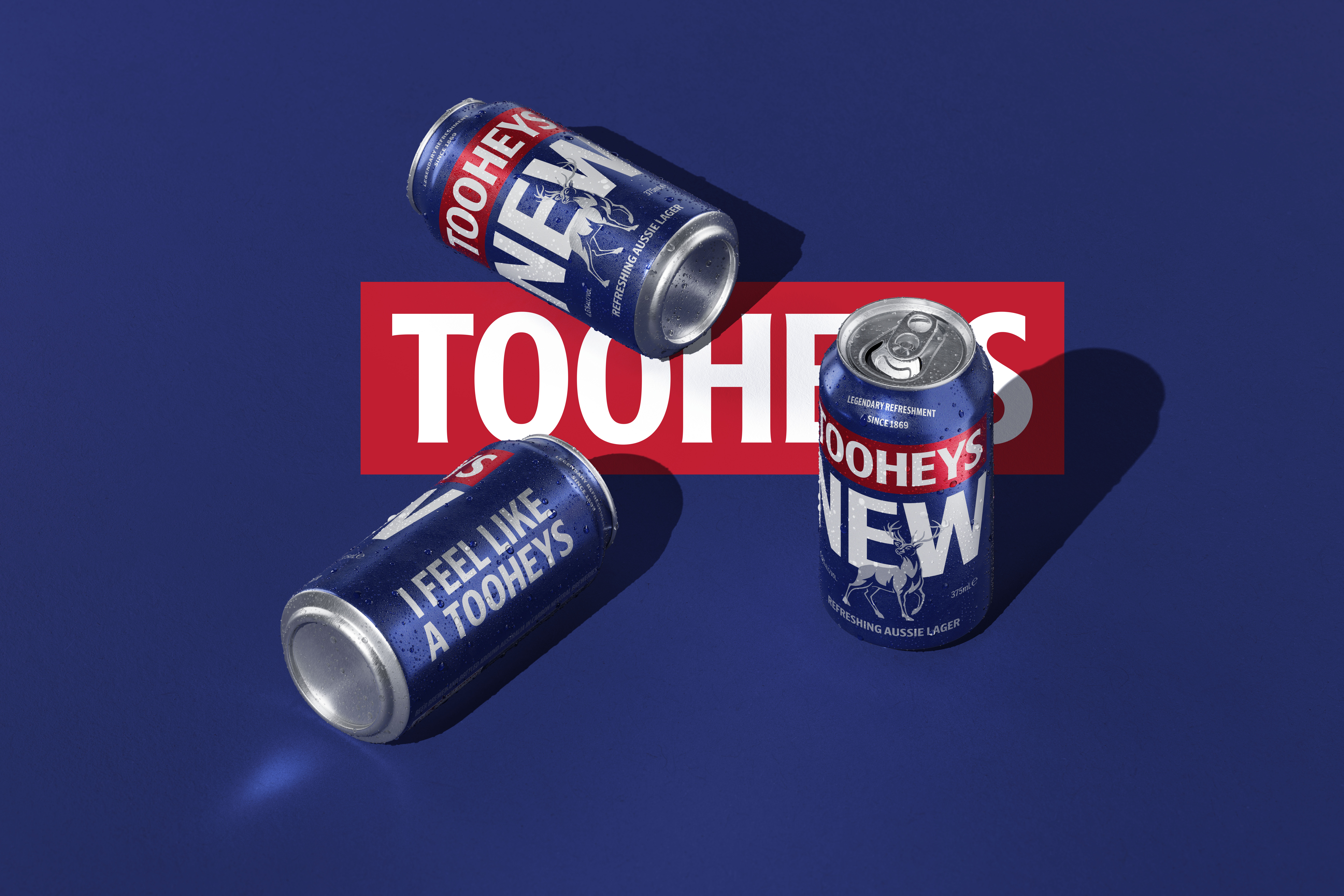
Iconic NSW beer, Tooheys, has unveiled a bold new look for its range of beers, with an overhaul of the brand’s packaging, designed by creative agency Weave. This packing revitalisation has given the beer brand a fresh, modern look, while simultaneously reflecting its rich history and enduring commitment to brewing great, refreshing beer.
As the first major update to Tooheys core packaging since 2015, leading beverage company Lion says the contemporary new appearance showcases Tooheys’ core brand assets, whilst still nodding to the brand’s rich 154 year history.
Chris Allan, Head of Core Beer Marketing at Lion Australia, said, “Tooheys is a brand that has over a century and a half of stories under its belt – so there is a challenge in moving too far away from the past and our rich legacy. We feel the new packaging pays tribute to our proud heritage as well as modernising in a way that allows the core brand assets to shine.”
Mick Boston, Head of Design at Lion Australia, said, ”Weave and Lion worked incredibly collaboratively on the Tooheys project. It is such a fine line refreshing an iconic brand like Tooheys, retaining all the well-loved memory structures whilst setting the brand up for the future. We’re confident we have created a look that honours our impressive past but keeps the brand moving forward.”
Creative Director at Weave, Dan Cookson, says of the evolution, “This wasn’t about throwing yesterday away, we needed to both respect the past and have the courage to move forward, reintroducing it to a new audience while also rekindling the love held by existing Tooheys fans.”
Tooheys Extra Dry required a different approach since it has always been slightly different to the rest of the trademark and it is a clear-bottled, even more refreshing variant. The established date has been replaced with a product descriptor and finished with the recognisable white diagonal slash that has been a defining element of the beer since its invention in 1994. The stag has been used to connect the Extra Dry product name with the Tooheys wordmark, elevated above the stag.
A sleek, colour-refresh has also been applied to the product label for Tooheys Old, replacing the previous maroon logo to its original all-black colour scheme, complementing the refreshing Dark Ale.
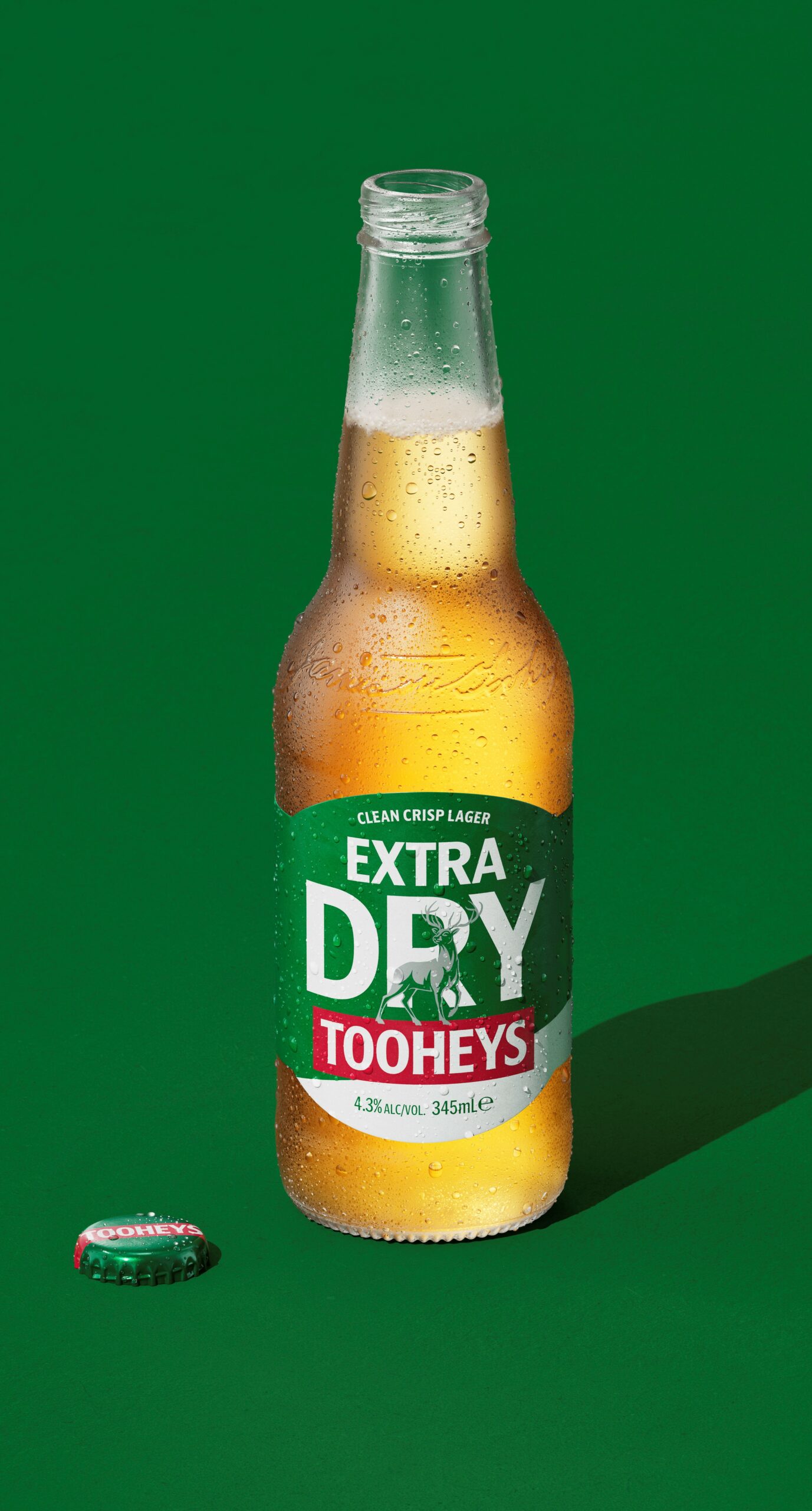
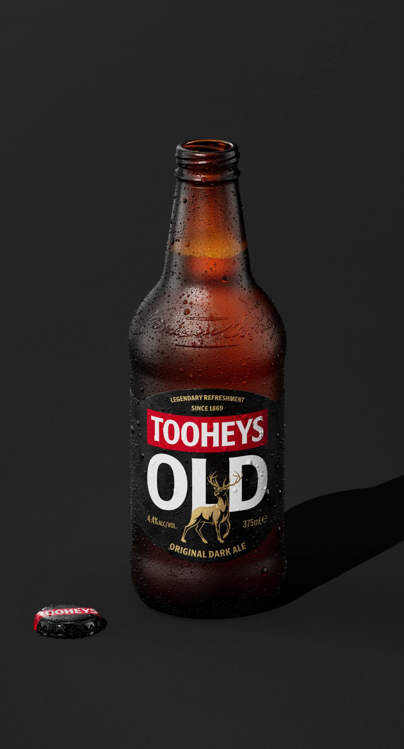
The new modern design has been rolled out across the entire Tooheys portfolio, including Tooheys Old, Tooheys New and Tooheys Extra Dry.
“We’re excited by the reimagined Tooheys design and feel it will resonate with current fans and new Tooheys audiences. Whilst there is a new look packaging, the great Tooheys taste remains unchanged,” added Mr. Allan.
The new Tooheys packaging will be available to purchase from today, 17 April, at leading liquor stores across Australia. For more information, visit www.tooheys.com.au and to stay up-to-date on Tooheys follow their Facebook and Instagram.


