Beers
14 Mar 2024
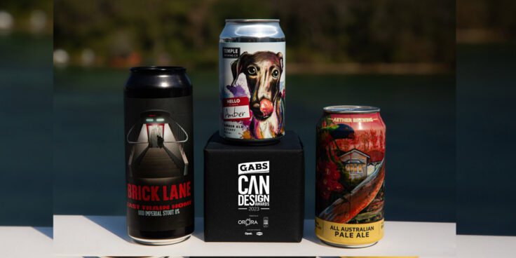
A delightful drawing of a greyhound reflecting Victoria’s Temple Brewing’s partnership with the Amazing Greys has taken out top spot and the coveted Orora Golden Can Trophy in this year’s GABS Craft Beer Can Design Awards! The winning design called HELLO, MY NAME IS AMBER was created by Raymond Lim from Ray L Creative, who also takes home $1000 in cash.
The annual Can Design Awards, presented by Australia’s largest beverage can solutions provider Orora, in association with Opal Specialty Packaging and Bintani, are a true celebration of the incredible efforts that the creative teams at breweries put into each and every label, as the outside of the tin has become just as important as the incredible liquid inside, in an ever competitive market for consumer’s first impressions.
Australia’s most exciting Craft Breweries each entered one design into this year’s competition with a stunning one hundred and fifty five pieces of art on display in the GABS Digital Gallery.
After thousands of beer and art lovers cast their votes to determine the TOP 10 Finalists , it was over to the experienced panel of expert judges who had an incredibly difficult job of evaluating the finalists across six different categories, being visual & aesthetic appeal, creativity & originality, impact, brand identity, usability & messaging and design brief.
Brick Lane Brewing’s Last Train Home designed by Pete Johnson took out silver and the bronze award went to Aether Brewing’s All Australian Pale Ale designed by Drapl & Zookeeper (Artists, Wall Mural); Emma D’Anna (Aether, Graphic Design) & Emery Greer (Demographics, Graphic Design).
Along with the Orora Golden Trophy, Temple Brewing receive printing plates plus a ton of malt from Bintani. All runners up walk away with great prizes from Opal Packaging and accolades of recognition go to the top designs from each state.
The creativity in this year’s designs shows just how far the craft beer label has come. In what has been touted as one of the best craft beer can art galleries on the planet, you discovered inspiration from mystery, sci-fi and punk to pop culture, vintage, nostalgia and everything inbtween as artists all competed to bring the can to life. With consumer spending expected to being more frugal in coming months, the importance of standing out on shelf will be amplified and expectation is the creativity on labels to continue to evolve into one of the most critical parts of new beer releases.
“Each year the talents of our country’s creative designers just get better and better. Craft Beer cans have been transformed into a beautiful canvas and are now home to some of the best artistic designs in Australia. We are thrilled to be the presenting partner of the GABS Can Design Awards and shine a light on local talents” – Michael Hepworth, Orora Packaging Australia.
Hello, My Name Is Amber
Temple Brewing Co (VIC)
Raymond, Lim
“Oh, what a cute puppy that is.” This is the feeling we want this label design to evoke in our market. Ensure simplicity. A drawing of a greyhound made by our artist in the style of the Temple brand to feature our partnership with the Amazing Greys. Bright colours are used to convey the friendliness of greyhounds. The original name “Hello, my name is Amber” indicates that a new beer in the Amber Ale style has been released on the market. This dog’s name tag sticker introduces me and invites you to learn about and enjoy the beer.
Last Train Home Oud Imperial Stout
Brick Lane Brewing (VIC)
Pete Johnson
Each year, the Trilogy Of Fear range grows larger, darker, and more terrifying. To elevate the fear factor further this year, we decided to create thermochromic labels. These labels aim to capture the eeriness of a zombie apocalypse. A warm can of Last Train Home features a soul zombie staring at you from the bottom of the stairs as you rush to catch the last train to safety. As you chill the can, the air turns cold and a legion of zombies appears at the bottom of the stairs. Additionally, we sought to embody the flavour of Oud, known for its musky and animalistic characteristics, by incorporating the sensation of being trapped underground at the onset of an apocalypse.
All Australian Pale Ale
Aether Brewing (QLD)
Drapl & Zookeeper (Artists, Wall Mural); Emma D’Anna (Aether, Graphic Design) & Emery Greer (Demographics, Graphic Design)
This mural by DRAPL and THEZOOKEEPER with inspiration from Brooke and the Brookes Blooms team here in Meanjin/Brisbane, was designed and created to capture the spectacular and unique aspects to life in Australia and in particular Meanjin/Brisbane. From the classic building styles we are well known for, the wildlife, flora and even the picturesque peach sunsets of our classic winters, the amazing people who collaborated to bring this art piece to life have done so exceptionally. The feelings it evokes of the love of our land and our lives perfectly sums up the reason we worked years to bring this uniquely All Australian Pale Ale into being.
Lost Palms Brewing Co (QLD)
Amanda Baker
I began with an old grainy photo of my friend from a fishing trip taken back in 2015 or so. I redrew that and added in a simple sky, mountains and water. I wanted to convey a sense of peace, and create something for what would have been his 30th birthday that would make his friends and family proud. I wanted the can to be powerful, yet simple and not suffocating on itself. To portray the person he was, with some personal elements. 93JBJM was his cars rego. The handprints show his handprint in the white, with his baby girls handprint in black. He unfortunately did not get to meet her.
Black Hops Brewery (QLD)
Aidan Howes
The vision was to make a can look spiritual and reference someone looking into every detail of this brew, using a bright pink, blue and deep purple colour pallete. What Aidan came back with was incredible, a sentient being looking deep into a hop cone referencing the hoppy nature of the Hazy IPA within the can.
Fixation Brewing (VIC)
Adam Collins
I wanted to put the age-old debate of whether Die Hard is a Christmas movie or not to bed, by bringing in elements that made it indisputably festive. What’s more festive than John McClain eating a candy cane, front and centre after defeating Hans Gruber and his cohort particularly as presents rain down above from the exploding Nakatomi Plaza?
A stripped back colour palette takes the Die Hard ‘red’ to give it familiarity, allow a clear hierarchy of illustrated elements and is layered to reward those who look at it closely.
The fun continues throughout the rest of the can art with more Die Hard references to be found and a QR code linking to a Die Hard YouTube compilation.
Hawkers Beer (VIC)
Christopher Flem
For the foundational release that our Vintage Series is built upon, the 2023 Imperial Stout required something equally foundational in its representation of darkness—a reference to the colour of the beer itself, and the cold, wintery season of its release. As a collection of dark, formidable beers, the 2023 Vintage Series artwork takes on an overarching theme of monsters, creatures, and literary beasts that go bump in the dark night. The Grim Reaper is the very portrayal of darkness, making it an ideal figure to adorn the Imperial Stout. In the artwork, the hooded figure of Death tilts his head down in a sorrowful posture while snuffing out a candle, representing the very moment of mortality. As the smoke from the candle lingers and surrounds him, the figure inhales some of it, as if to acquaint himself with the soul he’s just collected. If there’s any one perfect personification of the cold, dark, boundless void, it is surely Death.
Blackflag Brewing (QLD)
Ross Holloway
Raw Aesthetic: The design had to embody the raw and gritty spirit of punk, reflecting the movement’s DIY ethos and fearless attitude. We drew inspiration from punk zines, concert flyers, and street art to incorporate hand-drawn illustrations, distressed textures, and anarchic typography.
Graffiti-Inspired Typography: The typography used was heavily influenced by graffiti art, with bold, distorted lettering and creative arrangements. This choice aimed to reinforce the chaotic and expressive nature of punk.
Vivid Color Palette: A vibrant and edgy color palette was chosen to make the design pop and draw attention. Fiery reds, vast grays, and deep blacks were used to create a visually striking contrast.
Rage Mascot: A fearless RAGE character was designed to personify the beer’s audacity and fearlessness. This punk-inspired mascot was given an irreverent attitude, challenging the status quo and inviting consumers to join the rebellion.
Through a combination of raw visuals, vivid colors, and iconic punk elements, the design sought to capture attention, connect with its target audience, and create an unforgettable brand identity.
Method Brewing (NSW)
Elliot, Walsh
The ‘delayed responses’ between the two breweries in trying to make this collaboration happen, made it feel like they might as well have been communicating in Morse Code! Hence was born the idea to create a Morse Code can design. The dots and dashes were painstakingly placed to create a striking and mesmerising can design.
We decided to take this baby to another level and build the design around a real, hidden Morse Code message. Phoarr! One that the punters could actually decode as their drinking this delicious beer. In leveraging off the idea, Method held a competition to see who could decode the can first, resulting in a huge buzz around the release of this tasty WCIPA, and a can design everyone was extremely proud of.
Mountain Culture Beer Co (NSW)
Marianne Fagan
This release was inspired by magicians and brewers, with colours influenced by the flavours of this New England IPA; coconut, mango and stone fruits. The label was firstly illustrated by hand, then finished and coloured in ProCreate. While this is a very unique and creative design, our brand comes through in the colours of this piece, making it the perfect representation of our imaginative style while still being representative of the Mountain Culture brand.
Aether Brewing – All Australian Pale Ale
Lost Palms Brewing Co – Yeah, Go On Then
Black Hops Brewing – XRAY HAZE
Method Brewing – Delayed Response – Double WCIPA
Mountain Culture Beer Co – Alliance Of Magicians – New England IPA
7th Day Brewery – Conspiracy Theory
Temple Brewing Co – Hello, My Name Is Amber
Brick Lane Brewing – Last Train Home Oud Imperial Stout
Fixation Brewing – Yippee Ki-Yay MF
Big Shed Brewing – Hannibal Nectar – Hazy Double IPA
Bowden Brewing – Maurice Chocolate Porter
Little Bang Brewing Company – Sun Bear Hazy
Rocky Ridge Brewing Co – Rock Candy
Beerland Brewing – Devil of the Sea – Imperial Stout
Wilson Brewing Company – Ginger Betty’s Alcoholic Ginger Beer
Shambles Brewery – Singularity – Hazy Mid
Du Cane Brewing Co. – Resting at Pinestone Creek MID
Moo Brew – Halfway Hazy
Heaps Normal – Coffee Run Stout
Mountain Yeti Brewing Co. – Honey hunter pilsner
Alice Springs Brewing Co – This is a Knife IIPA
Beaver Brewery – Colonel Caramel Stout